I recently began learning how to create data visualizations using R Studio. Here are some of the projects I have been working on.
Graph of diamond carat size to price, faceted by color and clarity
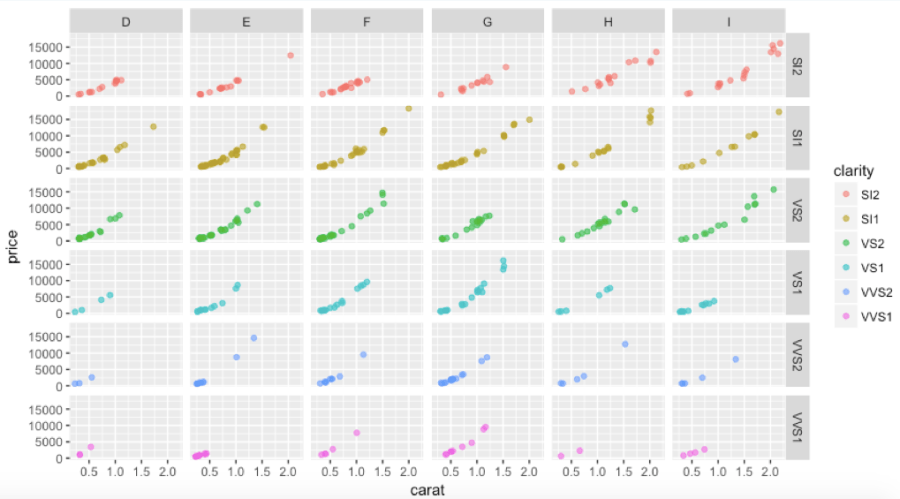
The above scatterplot was created using ggplot, geom_jitter, and facet_grid. Based upon the data, we can see that a half carat, D color, VVS1 (i.e. ‘Very Very Small Inclusion’) stone has the same market value as a one carat, D color, SI2 (i.e. visible ‘Small Inclusion’) stone.
Graph of assaults by state
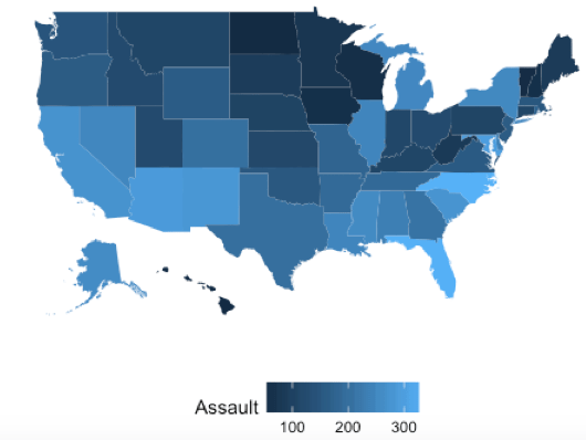
This graph was created using ggplot and geom_map. I set the aesthetic “fill” property to ‘assault’ (a continuous variable). GGplot uses gradient shading to represent the wide range of values.
I am really enjoying learning how to use R to visualize data. I have always been inclined towards analyzing data and finding patterns. Creating data visualizations makes it that much more fun and engaging! Stay tuned for more!
